![[Explaining] Numpy and PyPlot](https://dolevravid.com/wp-content/uploads/2025/04/campaign-creators-pypeceajezy-unsplash.jpg?w=1000)
NumPy is a foundational library for data science in Python. It excels at handling multidimensional arrays and matrices, along with offering a rich collection of mathematical functions to operate on this data. This makes NumPy a powerful tool for data manipulation, calculations, and extracting insights from raw data efficiently. Because of its capabilities, NumPy even serves as the underlying foundation for other popular data science libraries like Pandas. In order to brightest the insights that comes from the insights of NumPy, in this post I’ll combine it with matplotlib – the graphical library that adding the ability to create a useful plots, histograms and another graphical schemes.
To truly unlock the insights revealed by NumPy’s data analysis, we can leverage the power of Matplotlib. This visualization library allows us to create informative plots, histograms, and other graphical representations of the data. By combining NumPy’s calculations with Matplotlib’s visualizations, we can gain a deeper understanding of the patterns and trends hidden within our data.
Background Story
Let’s dive into the data and see if our assumption holds true! In this tour, we’ll explore the correlation between weight in adult males and females. While it’s commonly believed that men tend to weigh more, we’ll use data analysis to confirm this. Alright, first things first! Let’s collect some real data. The realer, the better! For the experimental I asked my co-scientist, Gemini, to recruit some volunteers with informed consent, of course, and measure their weight and height.
men’s list 👨
| Rank | Name | Height (cm) | Weight (kg) |
|---|---|---|---|
| 1 | John Smith | 175 | 81.5 |
| 2 | David Lee | 180 | 95.4 |
| 3 | Michael Kim | 172 | 77.1 |
| 4 | Ryan Jones | 178 | 75.22 |
| 5 | Charles Lee | 176 | 99.25 |
| 6 | William Chen | 182 | 80.15 |
| 7 | Andrew Brown | 170 | 78 |
| 8 | Daniel Miller | 179 | 89.1 |
| 9 | Kevin Garcia | 174 | 83.8 |
| 10 | Thomas Hall | 181 | 90.3 |
| 11 | Lev Lewinski | 173 | 69.3 |
women’s list 👩
| Rank | Name | Height (cm) | Weight (kg) |
|---|---|---|---|
| 1 | Alice Brown | 170 | 69.4 |
| 2 | Beatrice Lee | 162 | 70.88 |
| 3 | Chloe Garcia | 183 | 75.6 |
| 4 | Diana Miller | 178 | 68.55 |
| 5 | Emily Chen | 165 | 58.9 |
| 6 | Fiona Jones | 188 | 100.5 |
| 7 | Gloria Kim | 175 | 60.43 |
| 8 | Hannah Smith | 168 | 52.3 |
| 9 | Isabella Lee | 180 | 72.52 |
| 10 | Olivia Hall | 172 | 65.23 |
| 11 | Sarit Haddad | 168 | 79.87 |
Technical Analysis
We’ll start by bringing in NumPy, referred to as np for convenience. Then, we can create three separate arrays to store data for each sex category. Our goal is to analyze the characteristics of BMI, which is:
A calculation tool invented by a statistician in the 19th century that measures the ratio of height to weight.
After creating a BMI table for each sex, we will calculate the mean, median, and then compare the groups.
import numpy as np
# Data for males
m_names = np.array(["John Smith", "David Lee", "Michael Kim", "Ryan Jones",
                    "Charles Lee", "William Chen", "Andrew Brown", "Daniel Miller",
                    "Kevin Garcia", "Thomas Hall", "Lev Lewinski"])
m_heights = np.array([1.75, 1.80, 1.72, 1.78, 1.76, 1.82, 1.70, 1.79, 1.74, 1.81, 1.73]) # in Meters NOT CM
m_weights = np.array([81.5, 95.4, 77.1, 75.22, 99.25, 80.15, 78, 89.1, 83.8, 90.3, 69.3])

# Data for females
f_names = np.array(["Alice Brown", "Beatrice Lee", "Chloe Garcia", "Diana Miller",
                    "Emily Chen", "Fiona Jones", "Gloria Kim", "Hannah Smith",
                    "Isabella Lee", "Olivia Hall", "Sarit Haddad"])
f_heights = np.array([1.70, 1.62, 1.83, 1.78, 1.65, 1.88, 1.75, 1.68, 1.80, 1.72, 1.68])
f_weights = np.array([69.4, 70.88, 75.6, 68.55, 58.9, 100.5, 60.43, 52.3, 72.52, 65.23, 79.87])
Alright, with our data wrangled into arrays, let’s get down to calculating BMI! Just to satisfy my curiosity, I’ll print out the calculation results in a neat and organized way for each group.
# Ccalculating BMI for each group
male_bmi = np.array(m_weights / (m_heights**2))
female_bmi = np.array(f_weights / (f_heights**2))

print("Males BMI:", male_bmi, "\n","Females BMI:",female_bmi)
Output:
Males BMI: [26.6122449  29.44444444 26.06138453 23.74068931 32.04093492 24.19695689
 26.98961938 27.80812085 27.67868939 27.56326119 23.15479969]
Females BMI: [24.01384083 27.00807804 22.57457673 21.63552582 21.63452709 28.43481213
 19.7322449  18.5303288  22.38271605 22.04908058 28.29861111]
If you prefer to work with sorted data, the following code snippet can help you achieve that:
# First of all i'd like to merge the data into one array per sex type
male_data = np.core.records.fromarrays([m_names, m_heights, m_weights, male_bmi], names='name, height, weight, bmi')
female_data = np.core.records.fromarrays([f_names, f_heights, f_weights, female_bmi], names='name, height, weight, bmi')

# Sort the structured array based on the 'bmi' field
male_srtd = male_data[male_data['bmi'].argsort()]
female_srtd = female_data[female_data['bmi'].argsort()]
Now when the entire data is sorted by the values of the BMI, let’s place a histogram to visualize our data:
import matplotlib.pyplot as plt

plt.hist([male_bmi, female_bmi],label=['Male BMI', 'Female BMI'])
plt.xlabel('BMI')
plt.ylabel('Number of People')
plt.title('Comparison of Male and Female BMI Distribution')
plt.legend()
plt.grid(True)

# Display the histogram
plt.show()
Resulted histogram:
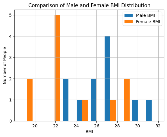
Based on our initial analysis, it appears that women tend to have lower weights compared to men. Now I’d like to analyze two more crucial details: median and average
# Average calculation
mens_mean = np.mean(male_bmi)
womens_mean = np.mean(female_bmi)

# Median Calculation
mens_median = np.median(male_bmi)
womens_median = np.median(female_bmi)

# Printing the results
print("Men's average is:",mens_mean, "\n Women's average is:", womens_mean)

print("Men's median is:",mens_median, "\n Women's media is:", womens_median)
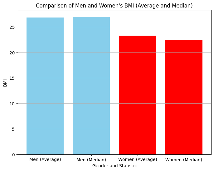
output:
Men's average is: 26.844
Women's average is: 23.299

Men's median is: 26.989
Women's media is: 22.382
How about using bar charts to take a look at this from another angle?
# Labels for the x-axis
labels = ['Men (Average)', 'Men (Median)', 'Women (Average)', 'Women (Median)']

# Data for the bar chart
data = [mens_mean, mens_median, womens_mean, women_median]

# Create the bar chart
plt.figure(figsize=(8, 6))  # Adjust figure size as needed
plt.bar(labels, data, color = ["skyblue","skyblue","red","red"])
plt.xlabel('Gender and Statistic')
plt.ylabel('BMI')
plt.title('Comparison of Men and Women\'s BMI (Average and Median)')
plt.grid(axis='y')  # Grid lines only on y-axis
plt.show()
Conclusions
This process has been a valuable learning experience for me. It’s important to note that all the data used in this post is fictional. The names were generated with the assistance of Gemini, but the data itself was created specifically for educational purposes. I hope you learned something too, see you in the next post! 👋
Photo by Campaign Creators on Unsplash


Leave a comment